
Chat Widget UI Component
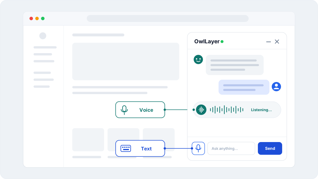
The Agentic UI SDK provides a pre-built, injectable UI component called OwlLayerWidget. This component renders a float chat bubble panel (supporting text messaging and real-time PCM voice streaming) in just a few lines of code.
1. Key Features
- Launcher: a pill with a call to action (
call,travel) or a round chat button (chat), anchored to a bottom corner. - One panel for text and voice: the panel keeps the same size and the same conversation in both modes. Continue by voice and Type instead switch modes; the server gives the voice session the conversation so far, and what is said aloud is transcribed in the panel.
- Voice visualizer: follows the microphone while the user speaks, spins while the agent thinks, pulses while the agent speaks, turns red on error. The header avatar and status follow the same states.
- The agent can end the call: while the panel is open, the widget registers an
end_calltool. When the conversation is over (the user says goodbye, the request is done), the agent calls it and the panel closes once the agent has finished speaking, so its last words are heard. The tool is removed when the panel closes. - Responsive and accessible: a bottom sheet on small screens, keyboard focus rings, labelled buttons, and no animation when the system asks for reduced motion.
- Shared presets:
call,chatandtravelcome from one stylesheet in@owllayer/core, so React, Vue and Svelte look the same. - Isolated CSS Styles: injected into the React Shadow DOM, or scoped under the widget root in Vue and Svelte.
2. Installation
The UI widget component is packed directly inside each SDK package:
# React SDK
pnpm add @owllayer/react @owllayer/core

# Vue SDK
pnpm add @owllayer/vue @owllayer/core

# Svelte SDK
pnpm add @owllayer/svelte @owllayer/core
3. Usage & Framework Integration
The widget can be loaded in two modes: Explicit Instance (autonomous, handles its own connection lifecycle) or Auto-Mount Mode (shares context inside a parent provider).
React Integration (Explicit)
import { OwlLayerWidget } from '@owllayer/react';

function App() {
  return (
    <OwlLayerWidget
      apiKey="pk_live_xxxx"
      endpoint="wss://api.owllayer.dev/owllayer"
      config={{
        agentName: 'Alex',
        agentTitle: 'Expert Assistant',
        mode: 'audio',
        stylePreset: 'call',
        allowModeSwitch: true,
        labels: {
          callToAction: 'Call Assistant',
          badge: '1 missed call'
        }
      }}
    />
  );
}
React Auto-Mount (Shared Context)
When using <OwlLayerProvider>, pass the widget configuration directly to the provider options to mount it automatically:
import { OwlLayerProvider } from '@owllayer/react';

function App() {
  return (
    <OwlLayerProvider
      apiKey="pk_live_xxxx"
      endpoint="wss://api.owllayer.dev/owllayer"
      config={{
        widget: {
          enabled: true,
          config: { stylePreset: 'chat', mode: 'text' }
        }
      }}
    >
      <YourMainApp />
    </OwlLayerProvider>
  );
}
Vue 3 Integration (Explicit)
<template>
  <OwlLayerWidget
    api-key="pk_live_xxxx"
    endpoint="wss://api.owllayer.dev/owllayer"
    :config="{
      agentName: 'Alex',
      agentTitle: 'Assistant',
      stylePreset: 'chat',
      mode: 'audio'
    }"
  />
</template>

<script setup>
import { OwlLayerWidget } from '@owllayer/vue';
</script>
Svelte Integration (Explicit)
<script>
  import { OwlLayerWidget } from '@owllayer/svelte';
</script>

<OwlLayerWidget
  apiKey="pk_live_xxxx"
  endpoint="wss://api.owllayer.dev/owllayer"
  config={{
    agentName: 'Alex',
    agentTitle: 'Support agent',
    stylePreset: 'travel',
    mode: 'audio'
  }}
/>
4. Configuration Options Reference (WidgetConfig)
Customize the layout, labels, and themes using the WidgetConfig properties:
| Property | Type | Default | Description |
|---|---|---|---|
agentName | string | 'Alex' | Name displayed in header panel. |
agentTitle | string | 'Assistant' | Caption displayed below the agent name. |
mode | 'audio' | 'text' | 'audio' | Initial capture modality. |
position | 'bottom-right' | 'bottom-left' | 'bottom-right' ('bottom-left' for travel) | Placement on the screen. |
stylePreset | 'call' | 'chat' | 'travel' | 'call' | Visual style aesthetic theme. |
allowModeSwitch | boolean | true | Show/hide the button to toggle between audio and text modes. |
fallbackToText | boolean | true | Automatic switch to text mode if microphone permission is denied. |
disableEndCallTool | boolean | false | Do not register the end_call tool (the agent can no longer close the conversation). |
theme | WidgetTheme | — | Color overrides, applied on top of the preset palette. |
labels | WidgetLabels | — | Interface localization parameters. |
Visual Presets Details
call: dark card with an orange accent, launcher pill with a phone icon; made for voice first.chat: light messaging panel with a colored header and a round launcher; made for text first.travel: dark glass gradient with a cyan accent and a larger orb; made for immersive voice experiences.
Each preset brings its own palette (PRESET_THEMES in @owllayer/core); the theme you pass overrides any of its colors, for example theme: { accentColor: '#0070c7' } to match your brand.
Labels (WidgetLabels)
Every text of the widget can be translated. Main keys:
| Key | Used for |
|---|---|
callToAction, subtitle, badge | Launcher (an empty badge hides it) |
idle, listening, thinking, speaking, error, reconnecting, live | Agent status |
textPlaceholder, send, emptyTitle, emptyText | Text mode |
switchToVoice, switchToText | Mode switch |
hangUp, close, muteMic, unmuteMic | Controls |
linesWaitingTitle, linesWaitingText, linesBusyTitle, linesBusyText | Virtual lines (all busy) |
micPermission, micUnavailable | Microphone refused or unavailable (shown in voice mode; the microphone button asks again) |